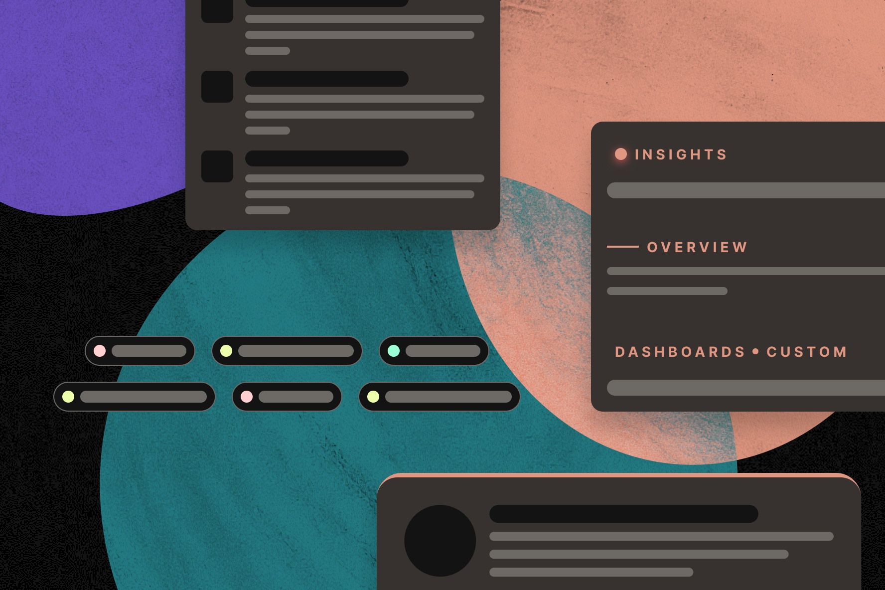
AI can generate a polished interface in seconds. But polished doesn't mean it makes sense.
Look closely at enough AI-generated interfaces, and you'll start to notice familiar patterns. Colorful borders. Unnecessary labels. Cards filled with copy. Decorative elements that look important but don't actually communicate anything.
These are all common UI patterns, and there's a reason designers use them. The problem is that AI applies them to just about everything, even when they don't make sense. That's when an interface starts to look and feel AI-generated.
The goal isn't to avoid AI or the design patterns it favors. It's to recognize when those patterns help users and when they're simply filling space.
Here are six common signs of AI-generated UI, and what I'd consider changing before putting them into a real product.
1. Excessive copy
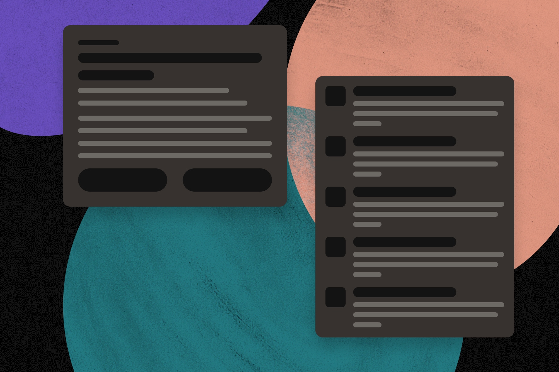
AI has a tendency to overexplain, and that doesn't stop at written content.
When generating UI, AI adds lengthy descriptions to elements that don't need them. Cards get paragraphs of supporting copy. Navigation items get explanations. Even simple actions come with unnecessary instructions.
The result is a crowded interface that makes users work harder to find what they actually need. Instead of quickly scanning a page, they're left sorting through a bunch of copy that probably didn't need to be there in the first place.
Not everything needs an explanation. If a card, button, or navigation item makes sense without additional copy, leave it out.
2. Colored borders without a purpose
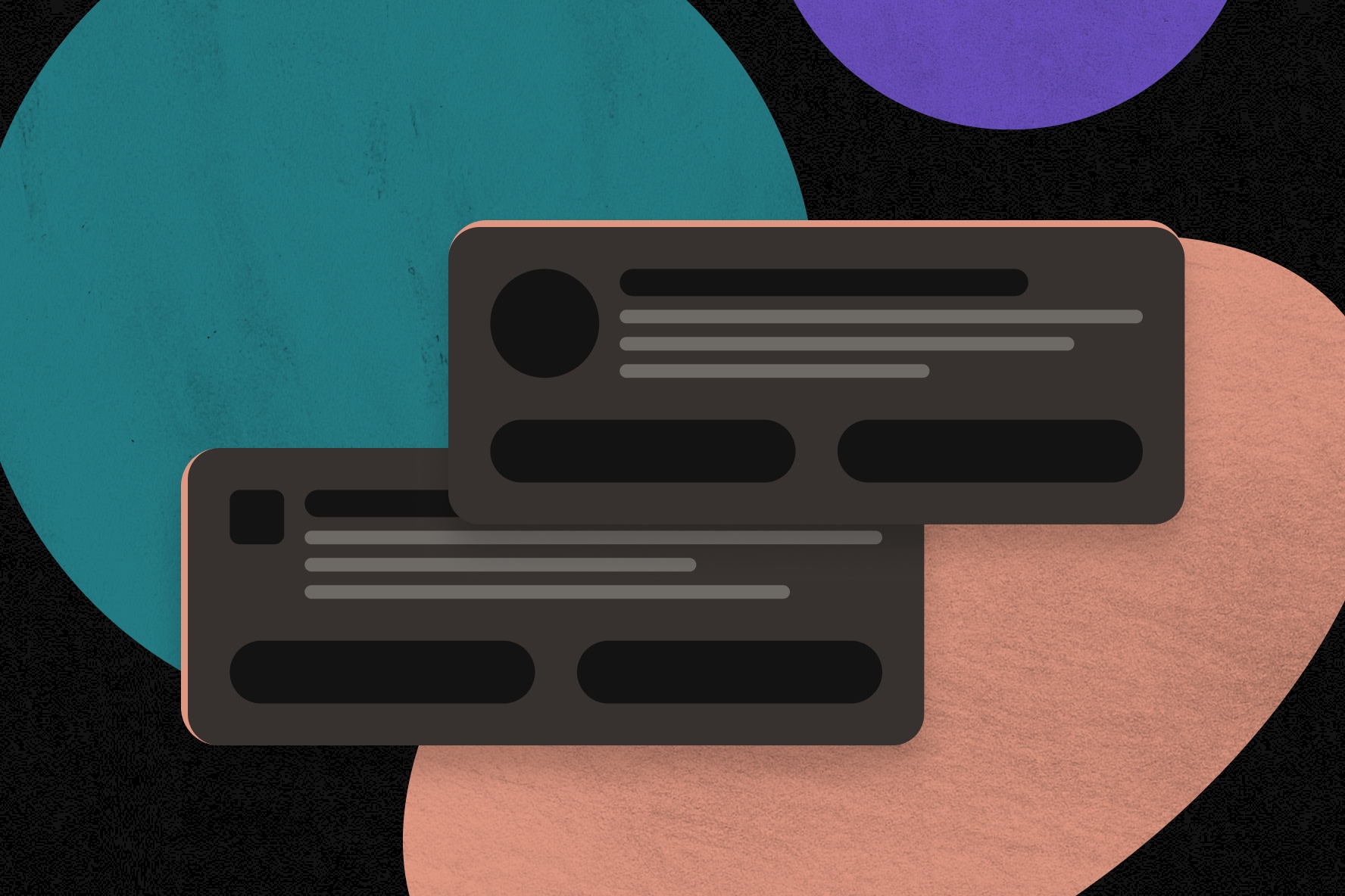
The single-sided colored border is the em dash of AI-generated UI. It's everywhere.
AI loves adding colored borders to cards, usually pulling from the brand's color palette. I've seen this across dozens of dashboards, but rarely does the color actually mean anything or connect to the information displayed.
I assume the intent is to make the card stand out or add more color to the page. And there's nothing wrong with using a colored border when it serves a purpose. But when it's just there for decoration, it becomes another unnecessary element on the screen.
If something needs to stand out, ask why. Is it more important than the other cards? Does it require action? Is the color communicating a specific status?
If there's a reason to draw attention to something, the design should reflect that. If you're just looking to add more visual interest, there are more interesting ways to do it than putting another colored border on a card.
3. Chips everywhere
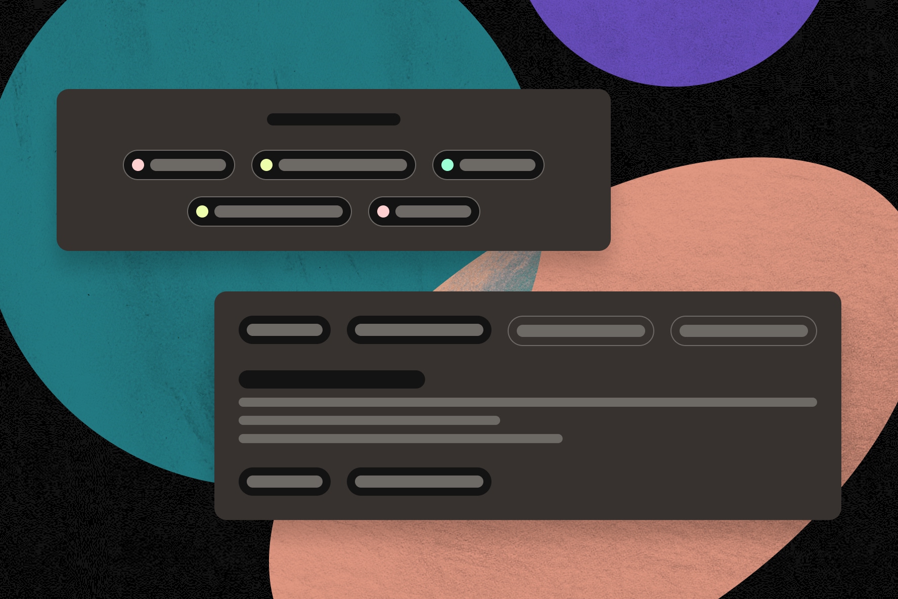
Chips are small UI elements commonly used to display information, apply filters, make selections, or trigger actions.
They're useful when applied intentionally, but in AI-generated interfaces you’ll see them almost everywhere.
A chip for a category. Another for a status. A few more for supporting details. Before you know it, they’re all over the page.
Chips are supposed to help users quickly identify information or interact with a page. But when everything gets a chip, it's harder to tell which ones are actually important or what you're supposed to do with them.
Take a look at how chips are being used across the interface. Are they part of a consistent system, like filtering or status indicators? Or are they just another way to style information that could be displayed as regular text?
Not everything needs to be a chip.
4. Decorative elements and typography
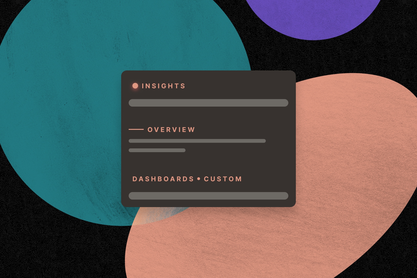
AI-generated interfaces often include unnecessary decorative details. Thin horizontal lines, glowing shadows, colored dots, and accents around cards and buttons.
These elements can add visual interest, but they should still have a purpose.
Status dots are a good example. Typically, these dots communicate something specific, like whether an item is active, pending, or needs attention. But AI will add colored dots throughout an interface without connecting them to any actual status or metric.
This can be misleading. Users are used to seeing green, yellow, and red indicators that mean something. When AI adds them for decoration, users are left guessing what the colors represent.
Typography is another area where AI repeats itself. Inter, DM Sans, and Roboto show up constantly. There's nothing wrong with these typefaces, but when every generated interface uses the same few fonts, they all start to look the same.
This is why you need a strong brand to start with. Simply choosing a more distinctive headline typeface can help a product look and feel different from the default AI-generated design.
Look at the visual details across your UI. Are those colored dots communicating a status? Are the decorative lines helping separate content? Does the typography reflect your brand, or are you relying on AI's defaults?
There's room to add personality to an interface, but it shouldn't come at the expense of clarity.
5. Unnecessary labels
Another common AI design pattern is excessive eyebrow text. These are the small labels that appear above headlines or section titles, usually to provide additional context.
AI will add them to almost every heading, sometimes even putting them both above and below the same title. They're usually uppercase, monospaced, and occasionally paired with one of those decorative lines mentioned earlier.
In most cases, the extra text isn't telling users anything they don't already know from the headline. Instead of creating hierarchy, the additional text makes it harder to tell what's important.
Take another pass at the labels above your headings. Would a back button, clearer headline, or more intentional typography better serve the user than another eyebrow label?
6. Every inch of space gets filled
AI-generated interfaces tend to fill every available space. There's always room for another card, label, divider, or decorative element, even when the page doesn't need one.
This is where a lot of the patterns we've already covered start to add up. Extra copy, chips, colored borders, and decorations all take up space. Put enough of them together, and the interface starts to feel crowded.
Empty space isn't wasted space.
Whitespace gives content room to breathe. It helps separate sections, establish hierarchy, and make a page easier to scan. Not every open area needs another element to fill it.
When everything on a screen competes for attention, nothing stands out.
Before adding something else to the page, evaluate at what's already there. You might find that removing a few elements makes the interface easier to use.
How to improve AI-generated UI
AI is an amazing tool for exploring ideas, generating layouts, and accelerating the design process. But the first result shouldn't always be the final design.
AI tends to repeat certain patterns, often without much consideration for whether they make sense in the context of the product. That's where a designer's judgment comes in.
Before moving forward with an AI-generated interface, answer these questions:
- Does every element serve a purpose? Look for borders, labels, and decorations that aren't adding anything useful.
- Is the interface easy to scan? Make sure important information and actions aren't getting buried under unnecessary copy.
- Does the design reflect your brand? Look beyond AI's default fonts and styles. Your brand should have a recognizable presence in the product.
- Are components used consistently? Check that chips, status indicators, and other UI elements have a clear role throughout the interface.
- Is there room to focus? Pay attention to spacing and visual hierarchy. Give important content enough room to stand out.
AI can make just about anything look polished, but that doesn't mean every design decision is a good one.
Use AI to help you design faster. Use your own judgment and design expertise to know what to keep, what to change, and what to remove.

