Brand Guidelines
Explore our brand guidelines and download approved assets for co-branding, promotion, and other moments when you’re bringing the Innovatemap brand to life.
Mission
To help leaders we believe in achieve the product visions they believe in.
Boilerplate
Innovatemap is a product and go-to-market partner for high-growth companies. Our team of senior experts works at the strategic level and in the trenches with you to fill critical gaps in product strategy, design, go-to-market, and brand—building the product experience and go-to-market systems that hold up as your business scales.

Before we get any further...
It's Innovatemap—one word, lowercase 'm'.
Our Logo
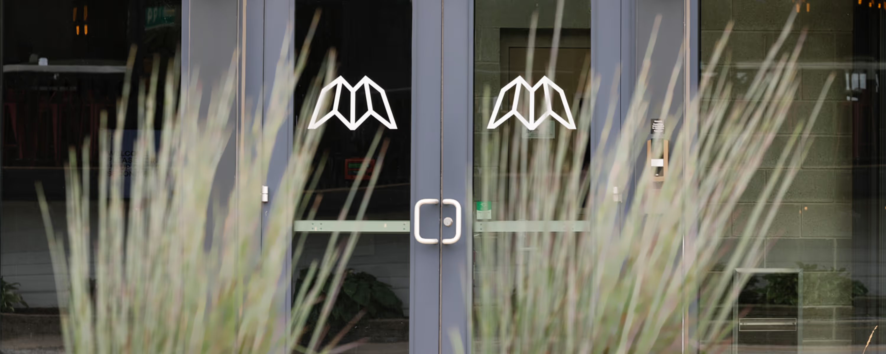
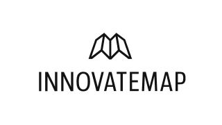
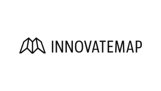
The Innovatemap icon has evolved to reflect our values and our presence in the product and go-to-market world. Close to a 1:1 ratio, it fits cleanly into nearly any space. It sits naturally alongside our wordmark, and it's just as strong standing alone. Bold and sturdy, it reflects the high-touch, personal way we work and the premium services we deliver.

Fonts
Our typography reflects who we are when we're in the room with clients, equal parts expert and partner.
Cirka represents the expertise. Expressive and editorial, it gives our brand a distinctive, premium presence rooted in the craft, judgment, and creativity behind our work.
Inter brings the partnership. Clear, approachable, and highly functional, it keeps our communication grounded and puts the message first.
Together, they balance craft with clarity, personality with purpose, and the high quality of our work with the humanity behind it.
Cirka represents the expertise. Expressive and editorial, it gives our brand a distinctive, premium presence rooted in the craft, judgment, and creativity behind our work.
Inter brings the partnership. Clear, approachable, and highly functional, it keeps our communication grounded and puts the message first.
Together, they balance craft with clarity, personality with purpose, and the high quality of our work with the humanity behind it.
Cirka
We use Cirka as our primary headline typeface.
Inter
We use inter for body copy.
Colors
Our palette starts with clean, timeless neutrals—off-white, black, and charcoal. Subtle gray tints handle the fine UI details. Peach brings warmth and optimism. Purple signals creativity and wisdom. Teal blends blue's stability with green's balance for a calm, trustworthy feel. Together, they create a confident, modern foundation that feels both welcoming and authoritative.
White
#F3F2ED
Charcoal
#37322F
Black
#37322F
Peach
#E09781
Purple
#6A50C2
Teal
#227A83
Team Headshots
Our senior experts have spent more than a decade helping high-growth companies build products people love and tell stories that connect. They bring the experience, judgment, and taste that only comes from doing the work and doing it well.
These headshots put a face to that experience, polished and ready to represent us wherever they're used.
These headshots put a face to that experience, polished and ready to represent us wherever they're used.

Illustrations
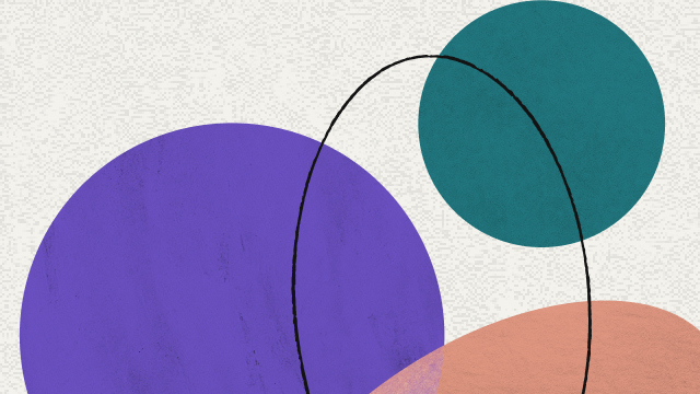
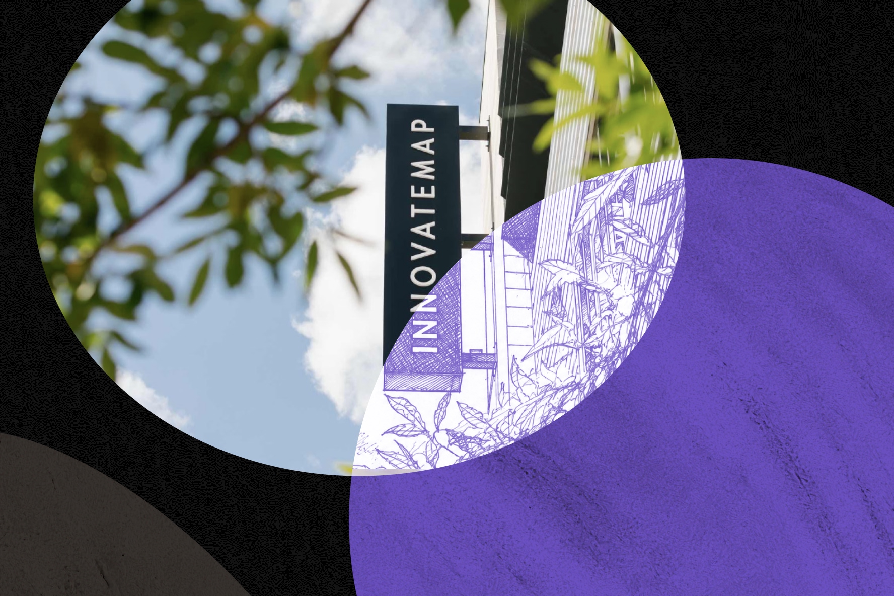
Our illustrations bring our brand concept, "The Space Between," to life, using intersecting forms, unexpected overlaps, and layered textures to show what happens when ideas, disciplines, and perspectives come together.
Use these shapes across digital and print assets to add visual interest and create a recognizable expression of the Innovatemap brand.
Use these shapes across digital and print assets to add visual interest and create a recognizable expression of the Innovatemap brand.

Questions?
Need something not listed above? Not sure if it feels quite right? Reach out. We’re always happy to help you put the Innovatemap brand to work.
Chelsea Douglass
Director of Marketing
chelsea.douglass@innovatemap.com
Chelsea Douglass
Director of Marketing
chelsea.douglass@innovatemap.com

Let’s build what’s next
Whether you’re launching a new product or scaling an existing one, we’re ready to help you move faster and smarter.
